Sculptural, clean, and dramatic
The “ZERO” type is a key element of the “Big Claims” spots, representing the goal of “zero nasal allergy symptoms.”
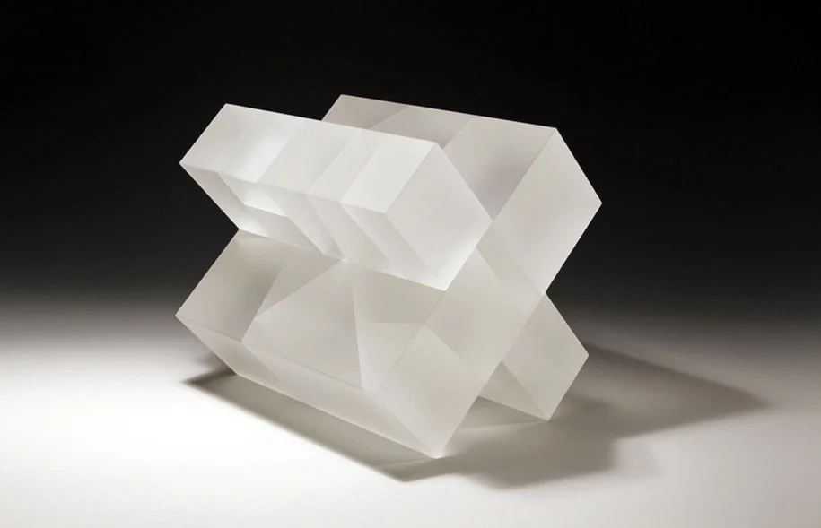
Like our environments and technology, the “ZERO” should feel as if we’ve built it as a high-end sculpture, casting slight shadows and reflections on our polished floor. But our “ZERO” type should be idealized, and FAR cleaner – i.e., with perfect edges, less reflections, and more readable – than a full-sized transparent word would be if we actually built it.
Adding to this, let’s make the “ZERO” more of a hero moment, filming the wide shot from a lower angle, and with a noticeable dolly move in order to create a sense of parallax. I’d also add a few glints of light animating on the typography, as if the camera move is capturing these hits in camera. The large scale of the typography would actually make any camera move fairly subtle, but the combination of a move and active lighting would help to make this a bigger moment, and draw the eye to the word.
Also, we should explore having Beth step out from behind letters (perhaps from between the “E” and the “R”, or simply from around the “O”), to add a small moment in which she is reflected through part of the letter, reinforcing the feeling that our “ZERO” is a solid object.
References
We'll create our "ZERO" typography in CG so we have absolute control over the placement, scale, and texture. We'll draw inspiration from geometric sculptures and various materials and textures, but we ultimately will create a cleaner, more idealized version that fits our needs better than any practical version could. (CLICK ANY IMAGE TO ENLARGE)


